SWIG
2024
A hard lemonade for the quieter side of summer.
SWIG is a hard lemonade brand inspired by when the day winds down. I developed its brand identity, custom wordmark, and packaging around the warmth and simplicity of a late summer evening.

Overview
SWIG is a hard lemonade brand built around the simple pleasures of summer. As the brand prepared to introduce its first product, I led the development of its visual identity, from the initial positioning and custom wordmark to packaging, 3D renders, and brand applications.
Problem
The hard lemonade category is crowded with established brands competing for the same audience. Much of the category revolves around high-energy summer imagery: beach parties, bright colors, and the excitement of the first drink.
SWIG needed to establish its own place in that market without relying on the same visual language.
Approach
Finding inspiration in the moment the day winds down.
I began thinking about the different moments that make up a summer day. While many beverage brands celebrate the excitement of arriving at the beach, I found more inspiration in what happens afterward.
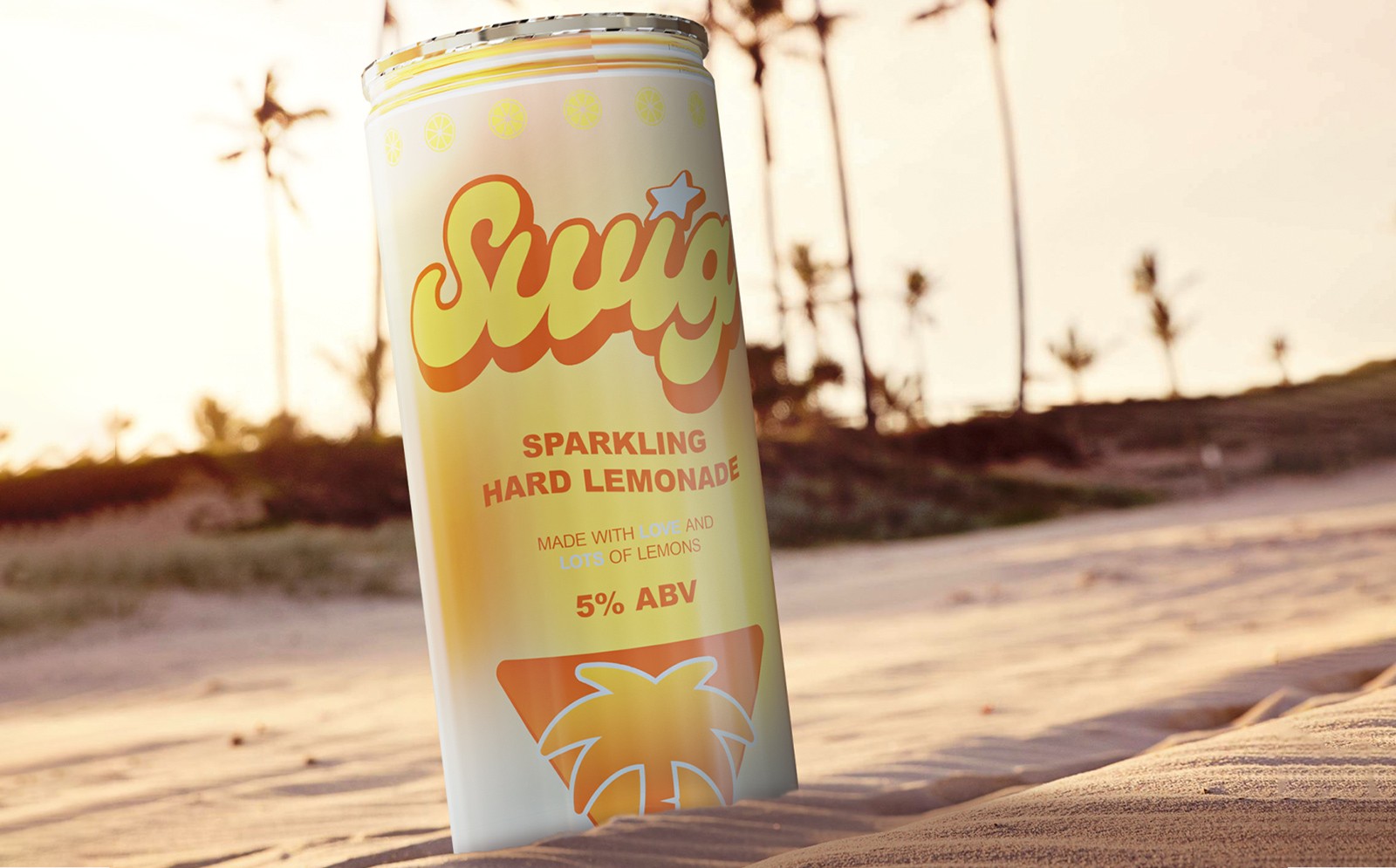
The sun is setting, there's still sand on your feet, and you're sitting with friends as the day winds down. That's where I wanted SWIG to exist.
This idea became the foundation of the brand, informing everything from its typography and color palette to the packaging and surrounding imagery.

Design
The initial wordmark was hand-drawn and loose, but it felt too reminiscent of a children's lemonade stand. I moved toward custom lettering that retained its warmth and rounded forms while giving the brand a more mature character.
The color palette followed a similar evolution. Early explorations leaned into brighter summer colors before settling on softer, warmer tones inspired by the sunset.
Together, these elements gave SWIG a relaxed, approachable identity with enough character to stand apart on the shelf.


The can became the primary expression of the identity. The custom wordmark, flowing graphic elements, and warm color palette carried the feeling of a late summer evening onto the product itself.
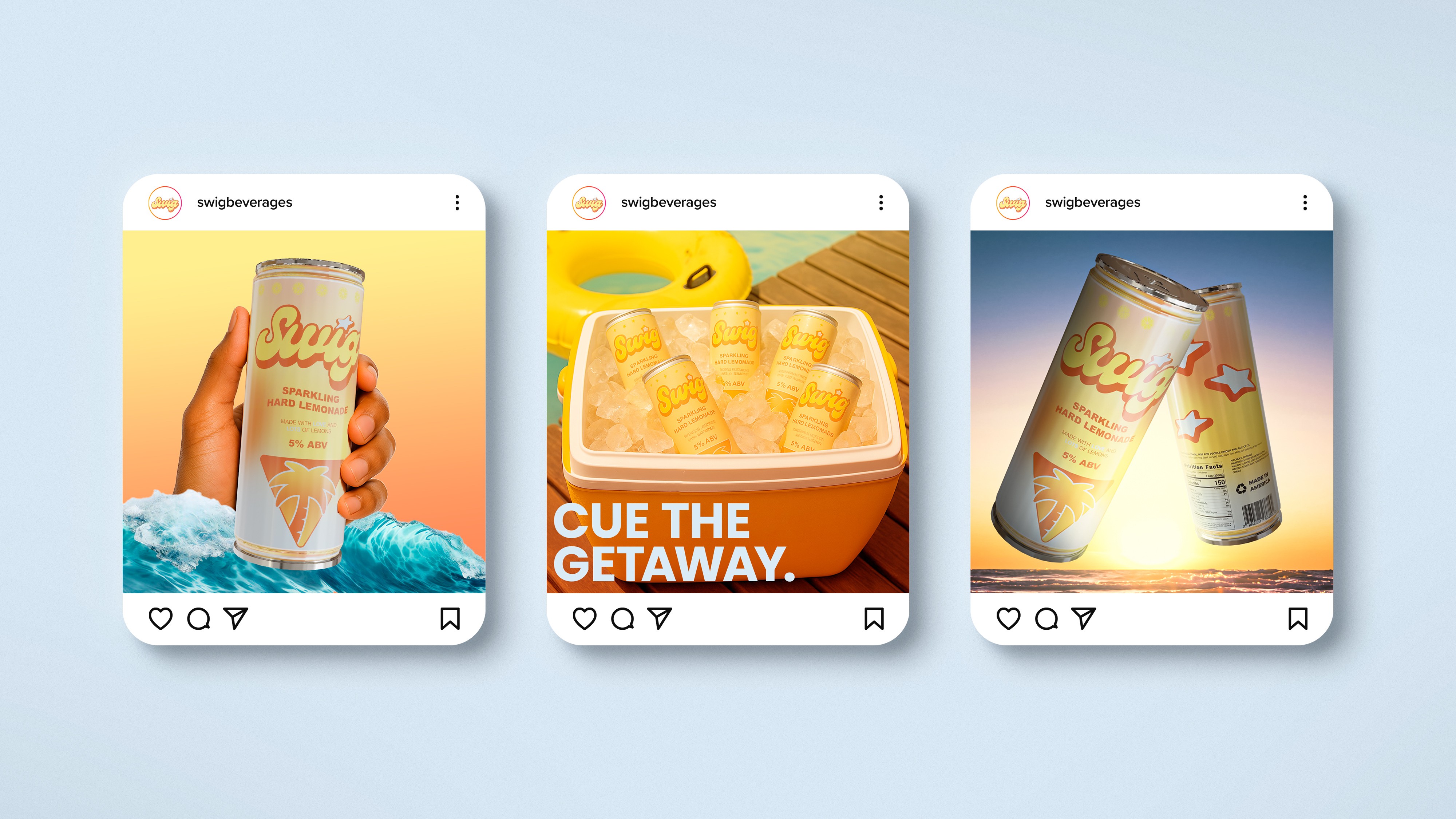
I extended the system through 3D product renders, promotional imagery, and digital brand assets, giving SWIG a visual language that could live beyond the packaging.

Reflection
Learning a new medium + bringing SWIG to life.
SWIG was the first time I had taken a brand from a rough lettering sketch all the way to a three-dimensional product. Seeing the identity take shape on a can, rather than just on a flat canvas, was one of the highlights of the project.
The most satisfying part was learning Blender to get there. It was an entirely new program for me, and learning its ins and outs while working toward a finished product made the experience especially rewarding.
Going from knowing nothing about the software to shipping renders of a brand I had built from scratch was something I was genuinely proud of.