Details
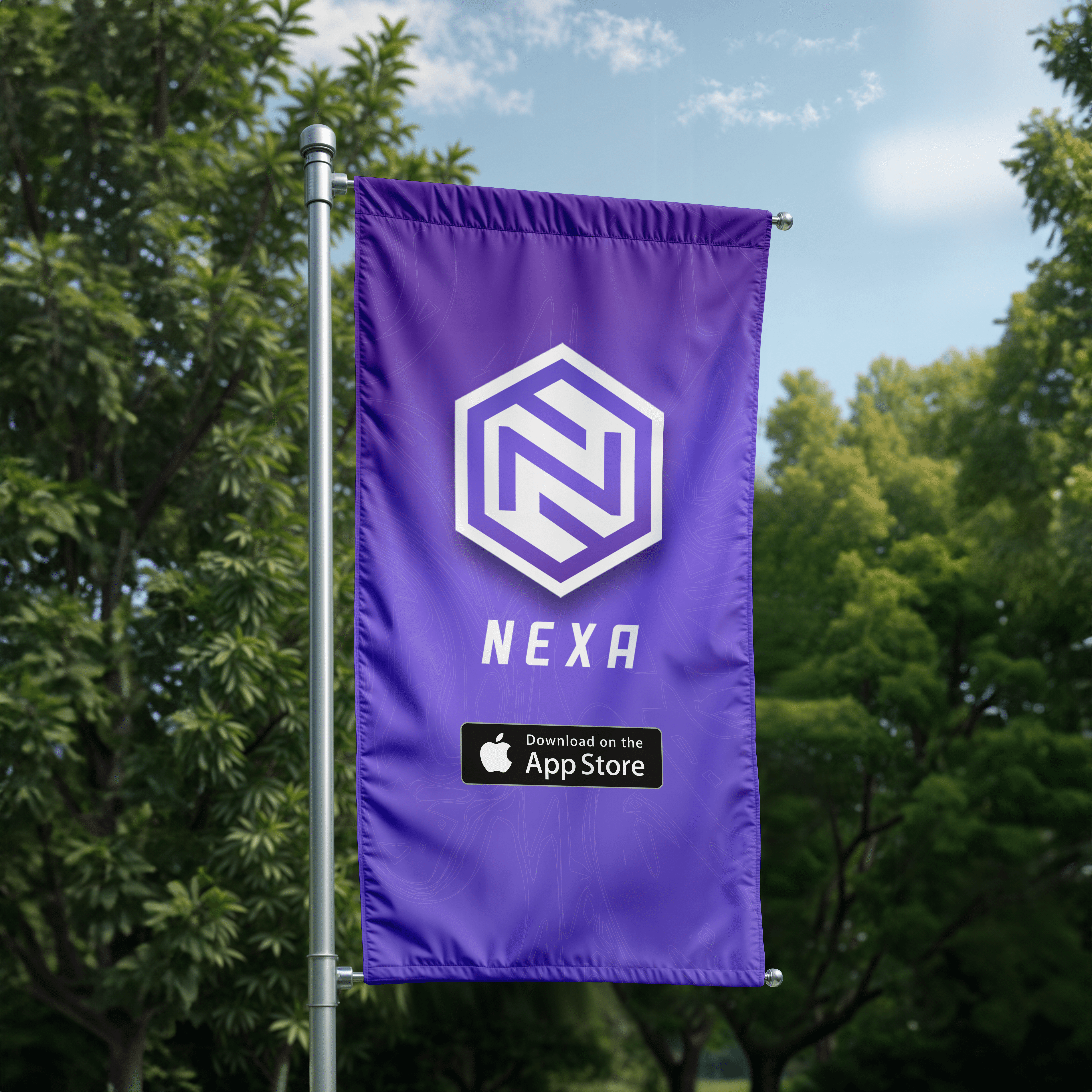
Nexa Tax
Nexa is a fintech app helping college athletes manage taxes under NIL rules. It's a category that didn't exist three years ago and a customer who has never been treated as one. I joined pre-launch and built the brand function from zero: visual identity, voice, social strategy, content engine, motion system, investor materials, and the campaign architecture that took Nexa from idea to a live brand with 300+ onboarded athletes and a real position in the culture.
Services
Brand guidelines
Brand strategy
Brand assets
Year
2026
ROLE
Head of Marketing & Brand · Operated as de facto CMO
The Real Problem
The Real Problem
The competition for a tax app aimed at college athletes is not other tax apps. TurboTax is not the threat. The threat is the athlete's attention. Every notification, every group chat, every game, every locker-room scroll. Tax software has a zero percent chance of winning that war on its own terms. So we didn't enter the war on tax software's terms. We entered on sports culture's terms, and made the tax product a teammate inside that world instead of a service running ads at the edges of it.
The Challenge
The Challenge
College athletes were earning real income for the first time and the existing tools were built for someone else. Accountants, freelancers, the parent who already knows what a 1099 is. The visual language of tax software is corporate by default: blue gradients, stock photography of handshakes, file with confidence messaging that assumes confidence is the problem. None of it speaks to a sophomore tight end with a Cameo deal and a NIL collective check sitting in his Venmo. Nexa's job was to make tax feel like part of the athlete's life rather than an intrusion on it without losing the credibility the product needed to be trusted with money. Too casual and the parents and coaches stop trusting it. Too institutional and the athletes never download it.
The Approach
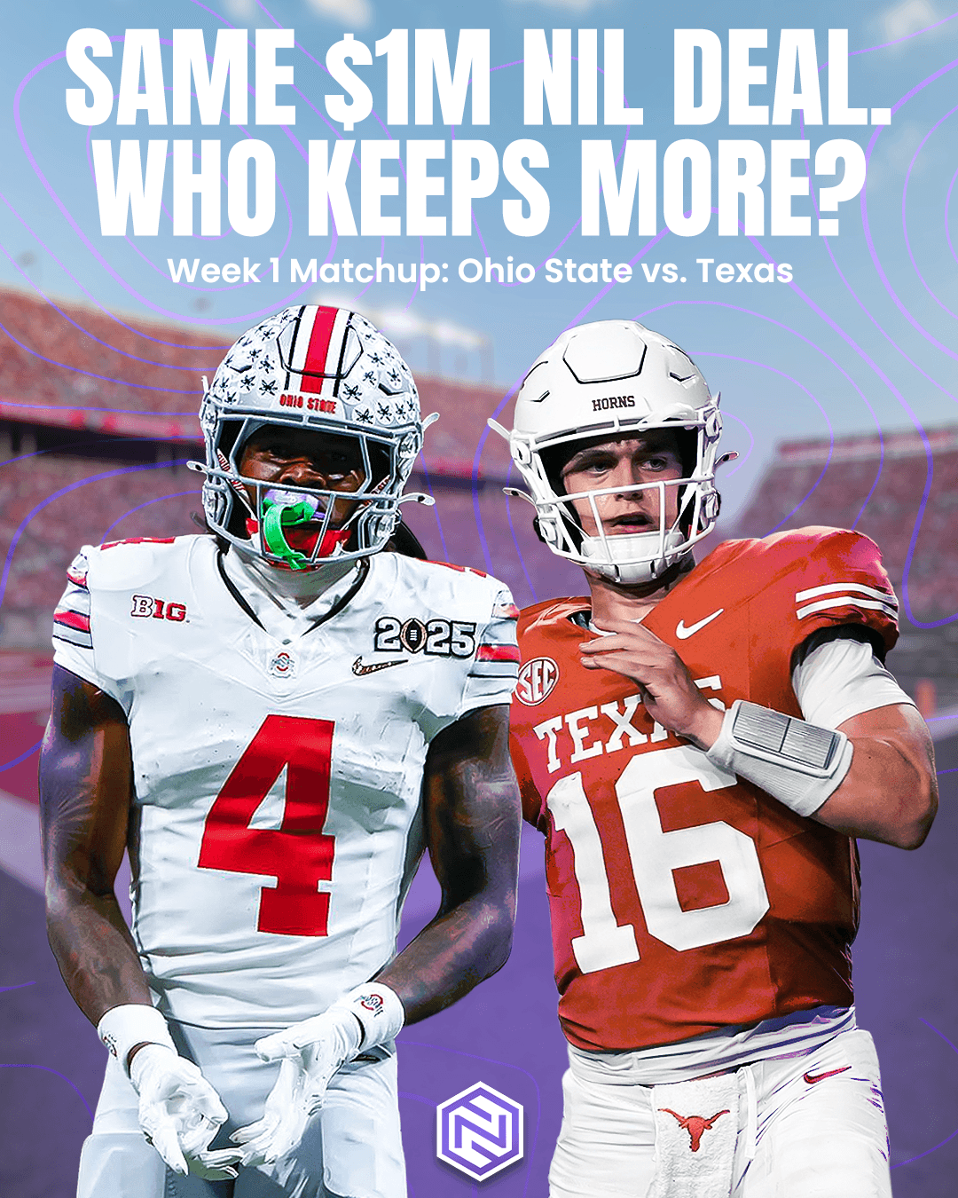
Before designing anything, I built a psychographic profile of the athlete. What they watch, who they follow, what music is in their headphones, which creators they trust, what the inside of their group chats sounds like. The brief wasn't design for college athletes. The brief was design for the specific texture of a 20-year-old's feed in 2024. That texture is sports media, locker-room humor, highlight reels, performance content, and the occasional financial wake-up call. We were building Nexa to live in that texture, not adjacent to it. From there, the positioning got specific. Nexa is not a tax service that talks to athletes, Nexa is a brand inside sports culture that happens to do taxes. The order matters. The first version of that sentence would have produced another fintech app with a basketball metaphor in the headline. The second produced what we actually built.
What Didn't Work
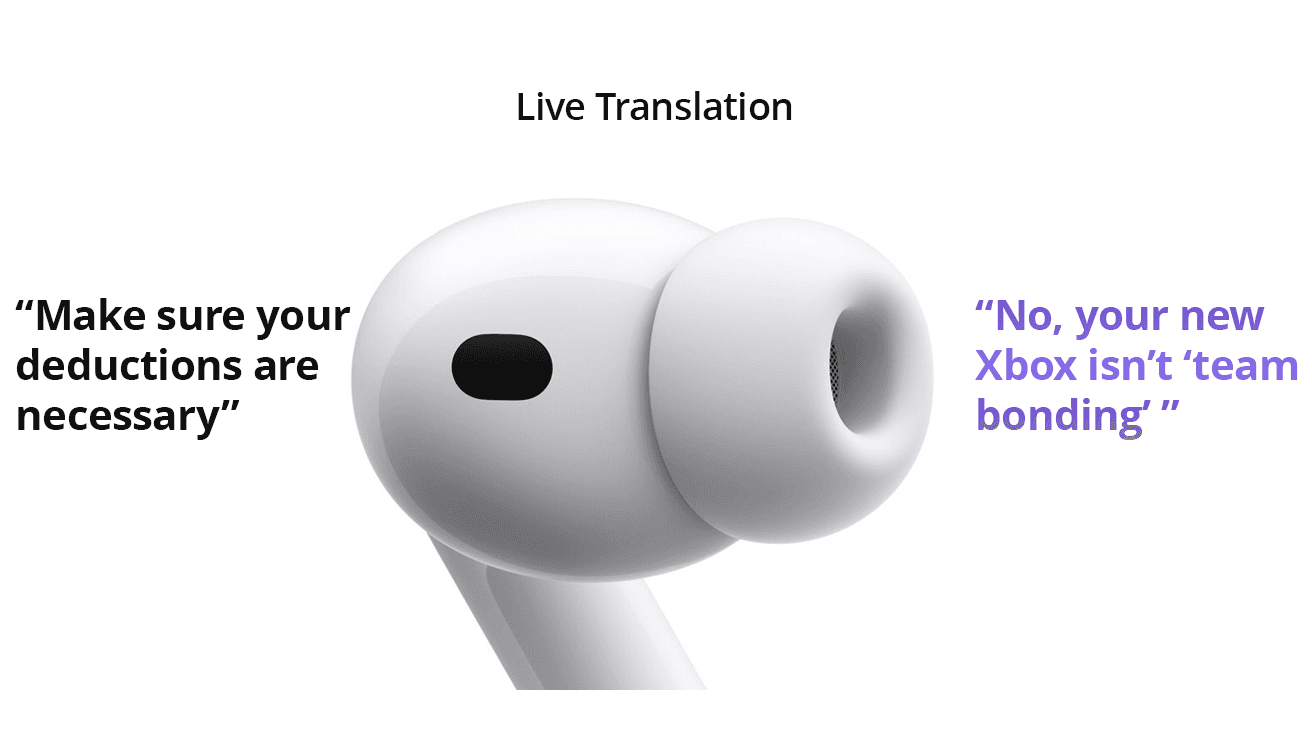
The hardest thing about Nexa wasn't a single design direction. It was the constant pull toward the version of the brand that already had a reference point. Every category I could have looked at for inspiration was wrong. Fintech references would have made Nexa look like a Chime knockoff. Sports media references would have stripped the financial credibility. Athlete-facing brands like Gatorade or Whoop were closer but still off. There was no shelf to copy from. Every visual decision had to be made without a reference, A/B tested in market, and revised the next week. We launched a brand and rebuilt half of it inside the first six months, a year of try, fail, try, fail, watch the engagement, adjust. The other thing to watch out for was the instinct to over-explain. Tax content has a gravitational pull toward here's what you need to know; long captions, dense graphics, advisory voice. We forced everything in the opposite direction. Three swipes, one idea, no jargon. If a piece of content couldn't be understood by an athlete scrolling between drills, we didn't post it.
The Solution
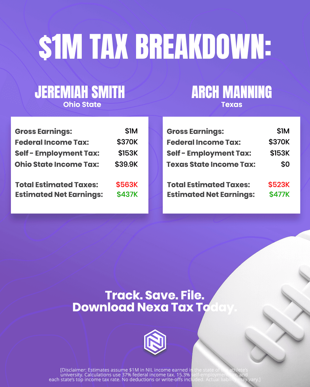
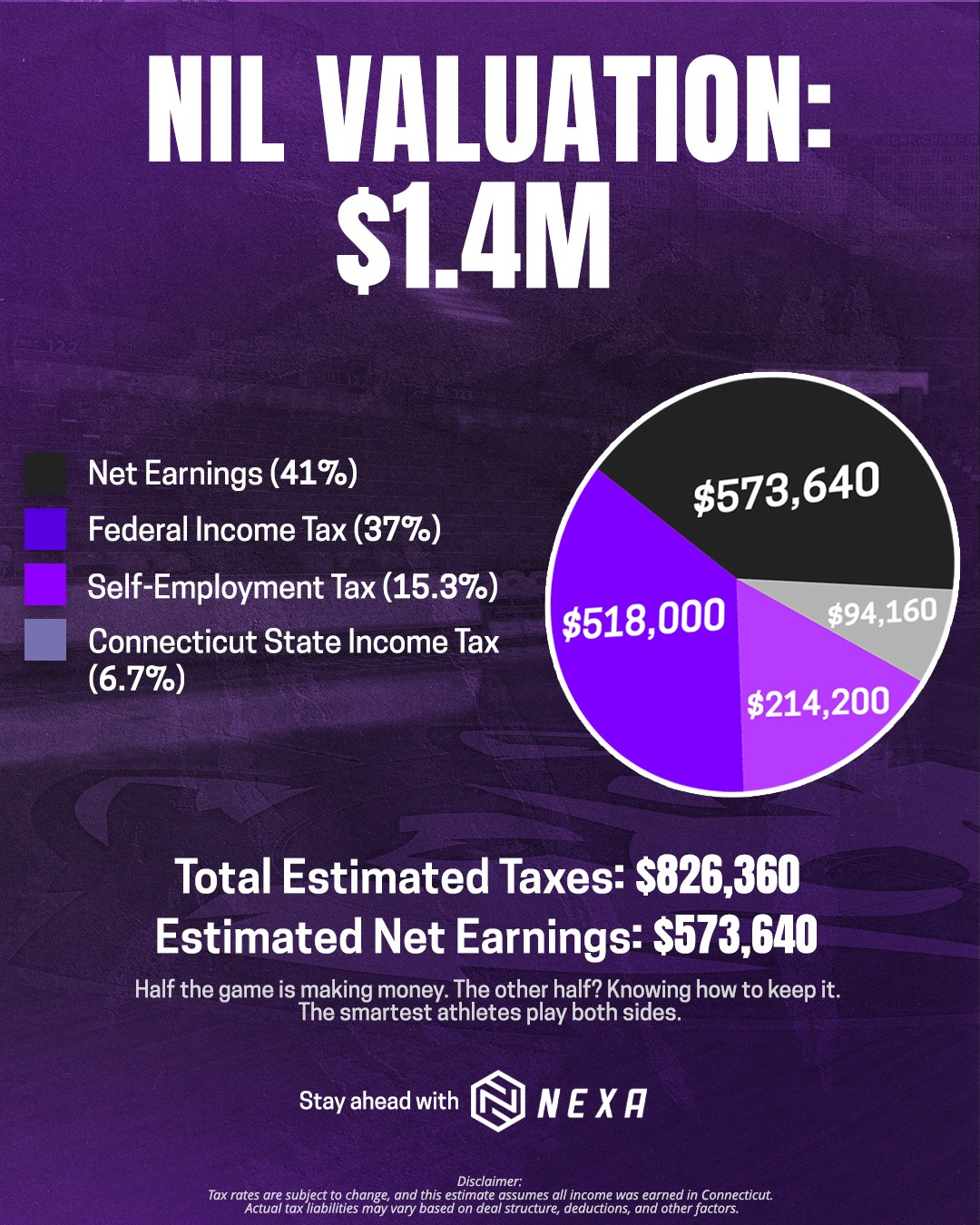
Nexa's identity is stripped of fintech vocabulary entirely. Fortified, sharp-shouldered typography. Layouts with the energy of a team graphic, not a finance app. A color system closer to NFL team identity than to financial software .The voice was built on a single rule: Nexa never sounds like a suit talking down to an athlete. It sounds like the teammate who happens to have read the rulebook. Direct, current, no jargon, no file with confidence, no we know taxes can be tough. The social engine was built on three pillars, each doing a different job in the feed. Educational carousels and reels breaking down NIL tax concepts in plain language. What counts as income, what's deductible, what to do with a 1099. Three swipes, one idea. The athlete leaves the post knowing one specific thing they didn't know before they tapped it. Sports and culture-coded memes that earned attention before they ever mentioned taxes. The memes did the work of getting Nexa into the algorithm and into the group chat. By the time an athlete saw an educational post, they'd already laughed at three Nexa posts that week. The brand was familiar before it was useful, which is the order it has to happen in. Community with athlete partnerships, brand ambassadors, and creator content that made Nexa visible as a brand other athletes trusted - not just an app, but a known name inside the culture. The motion system tied everything together. Tax content moves like sports media. Quick cuts, bold type, transitions that feel native to the platform. Nothing slow. Nothing soft. Tax software has historically been the slowest, softest content on the internet. Nexa's content moves like the athlete on the field.
The Result
A year into market, Nexa has 300+ onboarded athletes, growing app downloads, brand ambassador partnerships across multiple schools, and two business-journal features. The Instagram engagement rate sits above every competitor in the category, including the legacy tax brands with budgets several orders of magnitude larger. The brand is currently in active conversations for a seed round, with the brand identity and content engine carrying meaningful weight in those rooms. Nexa didn't outspend the competition and didn't out-feature them. It out-positioned them. A 300-athlete user base for a tax app sounds small until you consider that every one of those athletes downloaded a financial product because the brand felt native to their world. That's a different kind of conversion than tax software has ever had to measure.