Details
SWIG
SWIG was launching its first hard lemonade into one of the most crowded categories in beverage. They needed an identity that could hold its own next to brands with ten times the marketing budget, on a shelf where every can is screaming. I led creative direction and design end-to-end: strategy, logo, type system, color, packaging, 3D can, mockups.
Services
Packaging design
Logo design
Brand assets
Year
2026
ROLE
Brand Strategist, Lead Designer
The Real Problem
The Real Problem
The category is louder than it is differentiated. Every can is selling the same five seconds — the crack, the cold, the start of something. SWIG had to compete somewhere else entirely. The exhale rather than the entry. Not how do we look louder than the brands with bigger budgets. But what part of the day are we the only one in?
The Challenge
The Challenge
Most hard lemonade lives in the same hemisphere — neon, loud, the first drink of the day. Bad Bunny on the speaker, sun still high, everyone's just gotten to the beach. That space is saturated and SWIG was never going to win it on volume. The brief asked for "summer relaxation," which on the surface sounds like every other can in the cooler. I wanted to find the version of summer nobody else was selling.
The Approach
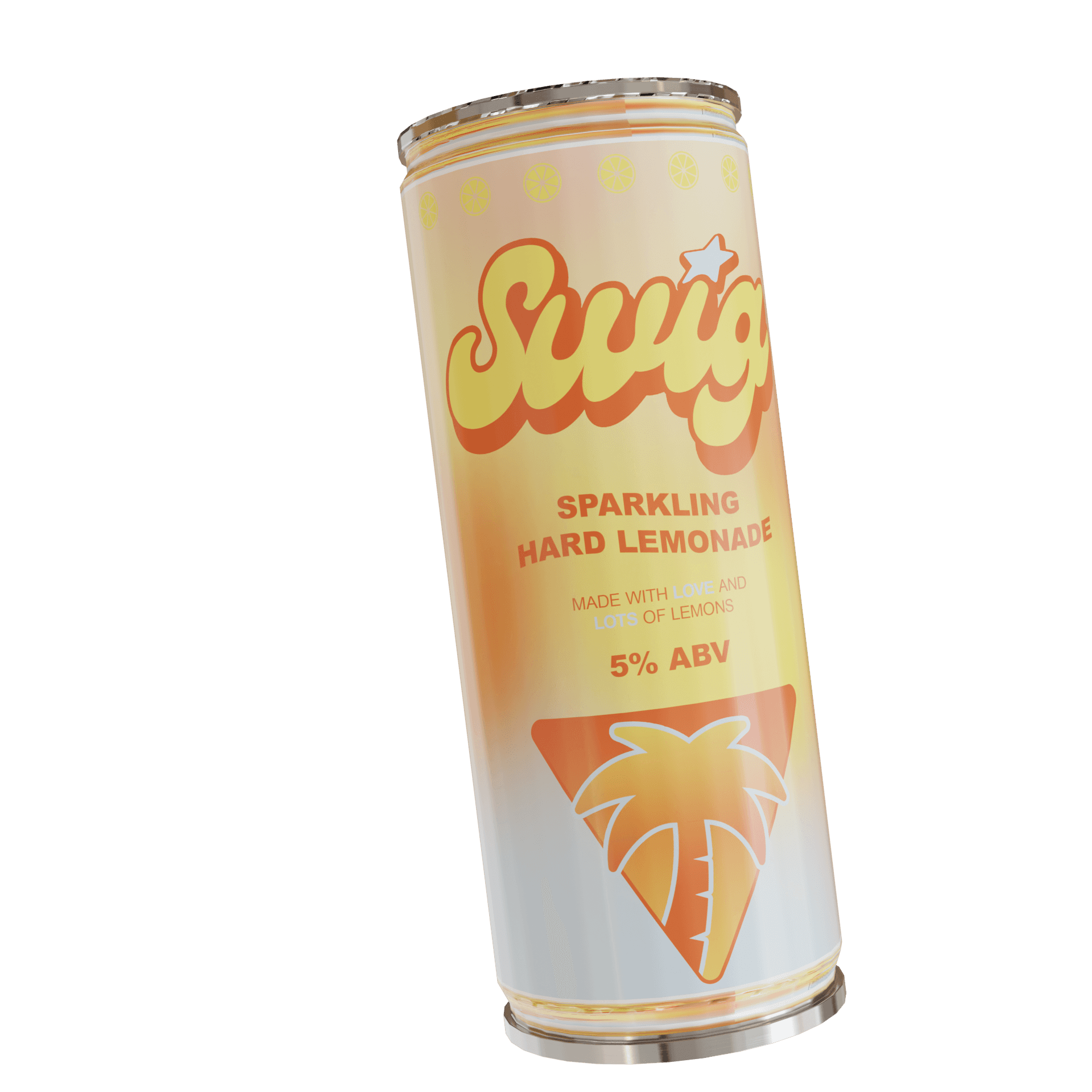
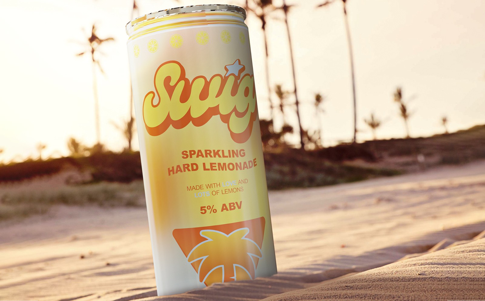
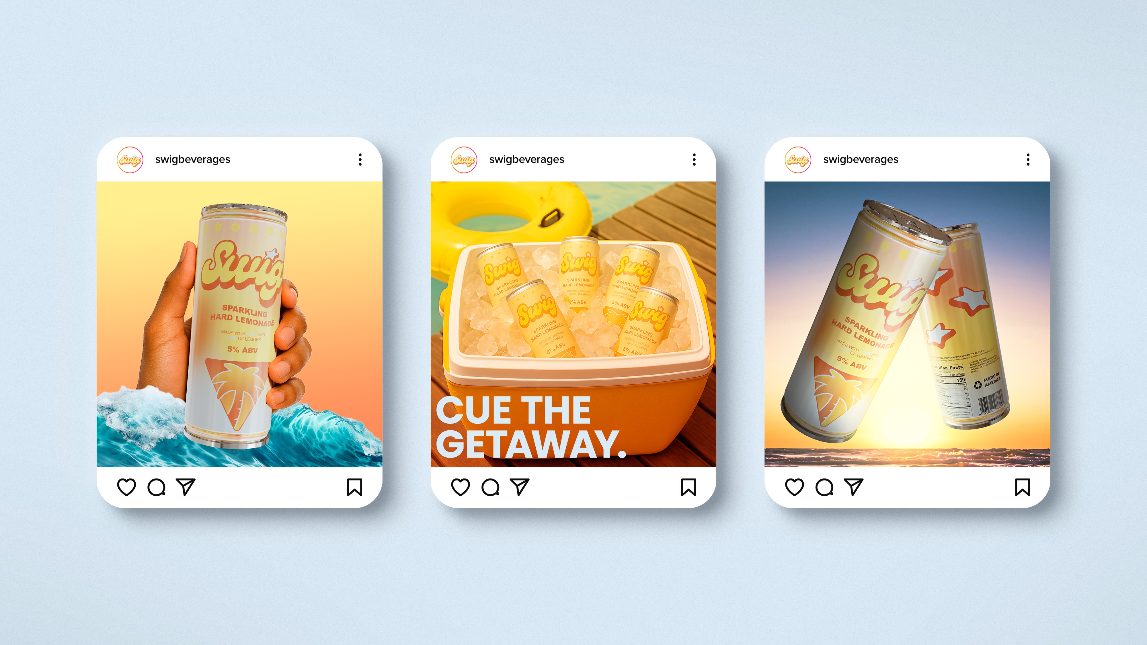
The category sells the opening of summer — arrival, energy, the moment you crack one open. SWIG had a chance to own the closing — the drink in your hand at 7pm, sand still on your feet, friends quiet for once because the sky is doing something. Hamptons evening, not Miami afternoon. Cape Cod, not South Beach. After, not during. Pastels instead of neon because neon is noon light, and we were selling 8pm. Rounded, custom letterforms. A palm in silhouette, because by the time SWIG enters the picture the sun is already behind it. Every visual choice had to pass one test: does this feel like the end of a good day, or the start of one?
What Didn't Work
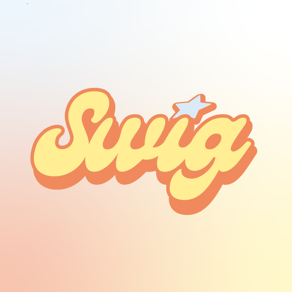
The first logo direction was hand-drawn — looser, more illustrative. It read like a kid's lemonade stand. SWIG isn't a kid's lemonade stand; it's the drink the adults reach for after the kids have gone inside. I scrapped it and drew a custom typeface instead — still warm, still rounded, but grown up. The brand could be relaxed without being childish. I also pulled back from a brighter, more saturated palette early on. It was technically "summer" but emotionally wrong — too much energy for a can meant to be opened at sunset.
The Solution
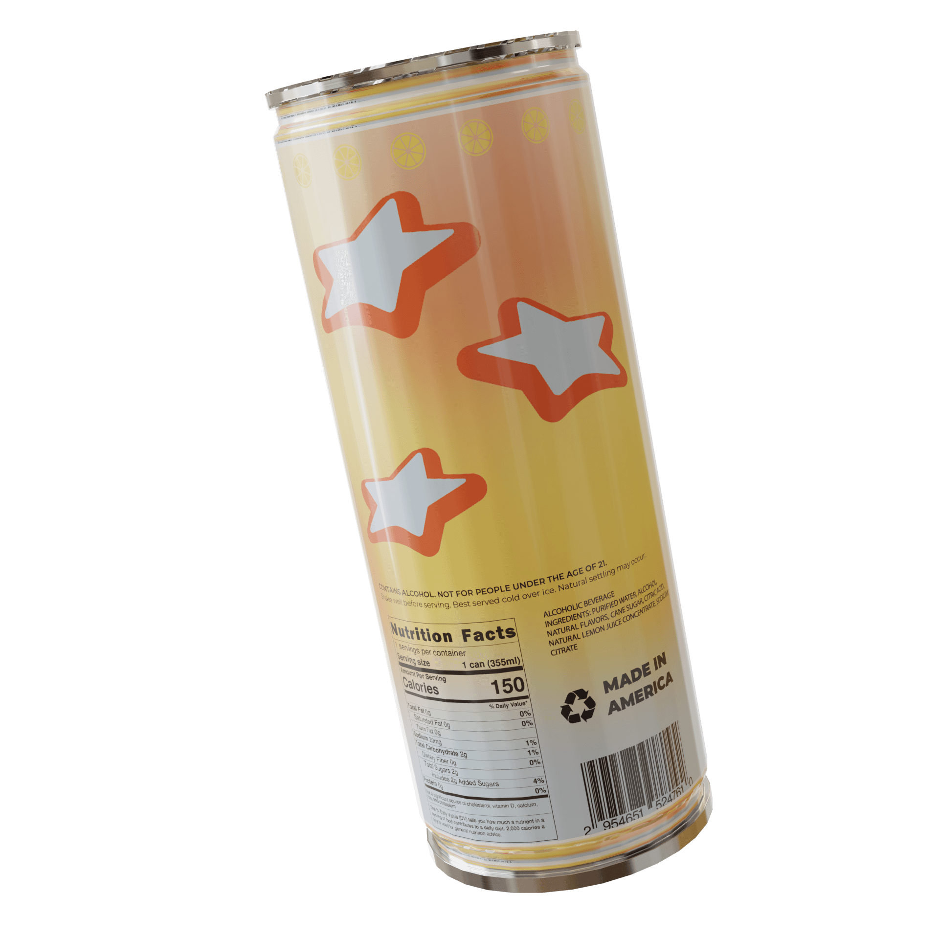
The identity is built on restraint. The logo is simple enough to register at a glance on a shelf and confident enough to stand next to legacy brands. The palette — soft oranges fading into light blues — is sunset compressed onto a can. The typography contrasts the logo for legibility but stays in the same family. The palm on the front tells you where you are, what time it is, and how you're supposed to feel, before you've read a word. I rendered the can in 3D and built shelf and social mockups so the brand could be evaluated in the contexts it would exist in — not as a flat label, but as a product on a shelf, in a hand, on a feed.
The Result
SWIG walked into the launch with an identity that didn't look like a startup's first attempt. It looked like a brand. The packaging carried into social, into early marketing assets, into the way the team talked about the product internally. More importantly, SWIG entered the category with a position no competitor was defending: the end of the day, not the start of it. In a shelf full of cans yelling about flavor, the quietest one had the most to say.